TMY Photo Guidelines
Good photos help bring your writing to life. The better the photos, the better the article. So here are a few guidelines to help you achieve photos that will take your article to the next level.
Large file size images are best.
- Please send original images in the largest file size possible. If you know how to adjust your camera’s settings, set them to record the largest image possible.
- Files formats should be .jpg, .tiff, or .png. No .pdf please
- You may need to send photos in several emails. Or compress them into ‘zipped’ files.
Concentrate on single subjects.
 For instance, if your image has lots of boats in it, they’ll end up looking like little specks with no detail – especially when they appear on a black and white page in the printed journal.
Leave some empty space around the image.
 Most people want to frame their shot as they would want it to appear, which is only natural. But during page design, we like to have some extra space around the subject to work with.
- Often we need to re-crop the image to fit the page.
- Also we often like one side of the image to “bleed” off the page. But when making the printed version, some of that outside photo edge can get chopped off. If we have some extra image to work with which does not include the subject, we can be sure none of your subject matter will get cut off. In this example, the right side of the image extends to the edge of the page. You’ll see there’s some extra space in the image to the right of the stern. If some of that gets cut off, no big deal.
Don’t get too close to your subject.
 If you get too close, your camera may not be able to focus properly (as in this example). Pull back until you’re sure the subject is sharp. Extra space around the subject is fine. We can crop it during page design.
Keep “how-to-build” photos simple and graphic.
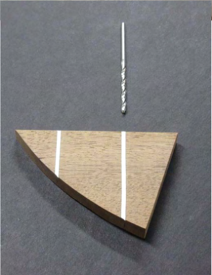
 Make your subject matter the center of attention.
- Backgrounds should be pared-down, unobtrusive, and contrasting (as in these examples).
- A piece of solid construction board, construction paper, or foam core works great.
- The less surrounding distractions, the better.
- If your subject is on the lighter side, shoot against a dark background and vice versa.
- A neutral grey, black or white background works well.
- Avoid using your camera’s flash.
- Rely on surrounding light – natural light, reflected light, and shop lights work well.
- Check your photos for hot spots
- Check your photos for reflections or distracting shadows.
- Again, leave some space around the subject matter.
- We will crop in to fit the page and highlight the subject.


Try keeping people shots candid.
Yes, we live in a “selfie” world, but posed people – especially in groups – can often look stiff and unnatural.
- Try showing people in action, with their boats, with their controls, during events.
- If you’re showing a group of winners, try getting their boats in the shot, show people conversing and having fun. Hey, they should be celebrating!
- Keep it to groups of three or four, five people at most. Otherwise, we’re back to showing specks on a page.
Check your photos on your computer screen before submitting them.
- Look at the focus for sharpness.
- Check the contrast.
- Often, once color shots are converted to black and white in the print edition, the subject matter will start to blend with the background – something we want to avoid.
Don’t add labels or reference numbers (1, 2, A, B) to images
If you need photos to be identified with labels such as “A” or “B”, please do not add them yourself. Provide instructions, and the Art Director will add labels that are sized appropriately and consistent throughout the issue.